Lost and Found in Translation: Design Notes from Japan - Part 2: The Blend of Old and New in Kyoto’s Branding
Oh boy—time really flies. I meant to post this two months ago, but life got busy. Now that I’ve finally found a moment, I’m excited to resume this short series.
To recap: earlier this year, I returned to Japan for some family matters. But I wasn’t just hanging out with my adorable nieces or stuffing my face with sushi. I was observing UX pretty much everywhere I went.
Japan is fascinating on its own, but for a UX designer, it’s a unique learning ground filled with both inspiring and frustrating experiences.
This is the second entry in a four-part series, where I highlight some of the UX, UI, and branding practices I came across during my trip.
Kyoto: A City Where Old Meets New
I’m from Kyoto, a city that preserves tradition better than anywhere else in Japan. And no, it’s not just cool because Nintendo’s headquarters are there.
Kyoto served as Japan’s capital for over 1,200 years before Tokyo. Today, you can find centuries-old temples around every corner, and more than 1,400 businesses there are over 100 years old. Local bylaws even restrict building height and signage colours to protect the historic cityscape. It’s no surprise Kyoto is one of Japan’s most popular travel destinations.
At the same time, innovation thrives here. After the Kyoto Protocol brought global attention to the city, sustainability became a major focus (seriously, their garbage collection rules are no joke). Kyoto University consistently ranks among the world’s top research institutions, and the city is home to unique architectural styles that blend traditional and contemporary design. It’s not uncommon to see a 200-year-old machiya housing a sleek, modern café.

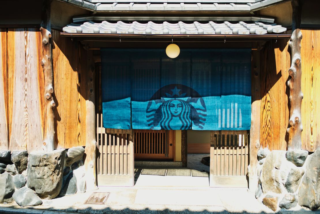
Source: https://www.cnn.com/travel/article/kyoto-traditional-starbucks

Kyoto’s strict signage regulations apply to everyone, including giants like Starbucks and McDonald’s. Their usual bold branding is softened to respect the local aesthetic. The result still feels strong, but in a quieter, more intentional way. Talk about UX design, right?
Though I now live over 8,500 km away, Kyoto continues to surprise me—and make me proud to be from there.
Branding That Honors the Past and Embraces the Future
This balance between tradition and modernity creates a distinctive branding culture in Kyoto. Here are a few examples I spotted around Kyoto Station that stood out for their elegance, simplicity, and cultural depth.
[IRODORI] – Tsuruya Yoshinobu
This crane logo is from IRODORI, a brand under the long-standing confectionery Tsuruya Yoshinobu. The design is based on the family’s kamon (crest) and intentionally blends old and new. In their official branding, not this store-front version, their brand colour navy blue represents their deep heritage, while the white symbolizes innovation. By modernizing their crest with clean lines and a contemporary palette, they’ve created a logo that feels both grounded and forward-looking.
[カランコロン京都] – Karan-koron Kyoto
The name itself is clever. Karan-koron is the onomatopoeia for the sound wooden clogs (geta) make when walking on Kyoto’s stone streets. Think “clip-clop,” but with a lighter, xylophone-like tone.
The logo's font choice matches that sound perfectly. It’s modern and minimal, but still captures the delicate, rhythmic charm of its namesake.
[みやこみち] – Miyakomichi
This one is doing several things at once:
It evokes a traditional Kyoto feel with a minimal design.
It mirrors the city’s iconic grid layout (goban-no-me).
It subtly incorporates the “み” (mi) from the brand name into the map-like structure.
It’s playful, clever, and easy to remember. Seriously, who came up with this?
Final Thoughts
In my last post, I focused on some of the frustrating UX moments I experienced in Japan. But this time, I wanted to highlight the many thoughtful, inspiring examples that make Kyoto such a fascinating place for designers. The ones mentioned above are just fraction of them.
If you ever get the chance to visit, make time to explore the details. Walk around the stations, side streets, and storefronts. You’ll find design that quietly speaks volumes.
More to come soon. Stay tuned for part three.
Thanks for reading,
taq


